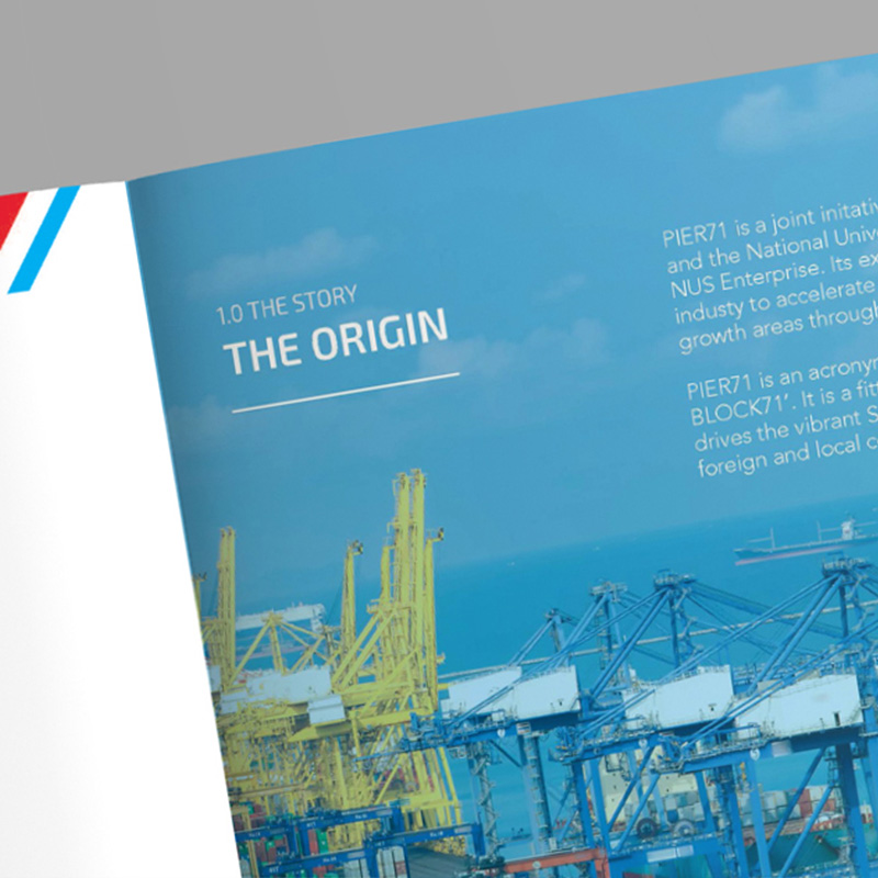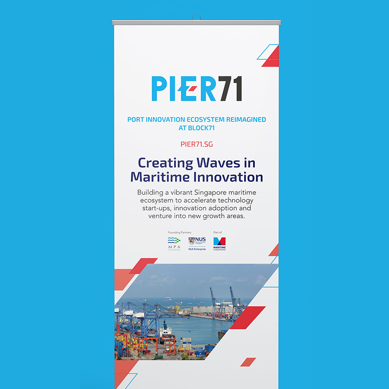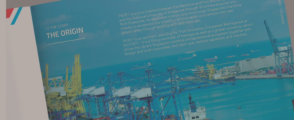
PIER 71
BACKGROUND
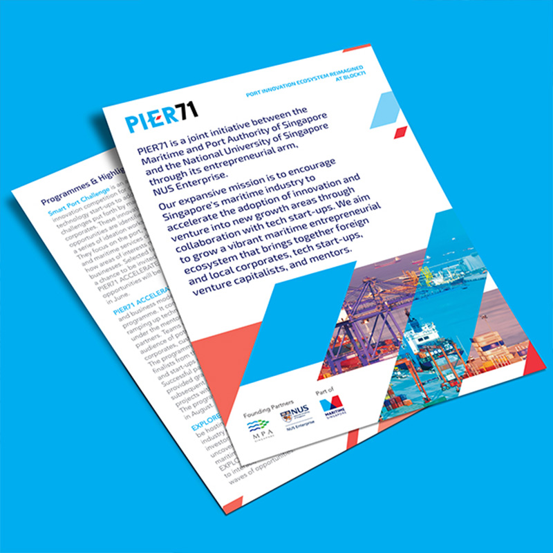
Pier 71 is an accelerator program formed as a joint initiative between the Maritime and Port Authority of Singapore and NUS, through its entrepreneurial arm, NUS Enterprise. Its mission is to encourage Singapore’s maritime industry players to accelerate the adoption of innovation and venture into new growth areas.The goal was to forge partnerships between startups and maritime corporates to strengthen and establish the best maritime technologies to draw international engagement.
STRATEGY
Piquant was called to brand the new program and create a set of guidelines to bring out the proposition of Pier 71 and position the initiative as a dynamic leader in the maritime industry. We spoke to the multiple stakeholders from MPA and NUS to understand the goals, intent and vision for the program.
IDENTITY
With the insights gathered, we brainstormed the name “Pier 71, that is the acronym for “Port Innovation Ecosystem Reimagined at BLOCK71’. The logo was inspired by the shape of the compass arrow, representing the act of being forward looking, showcasing Singapore as the global leader in the maritime field.
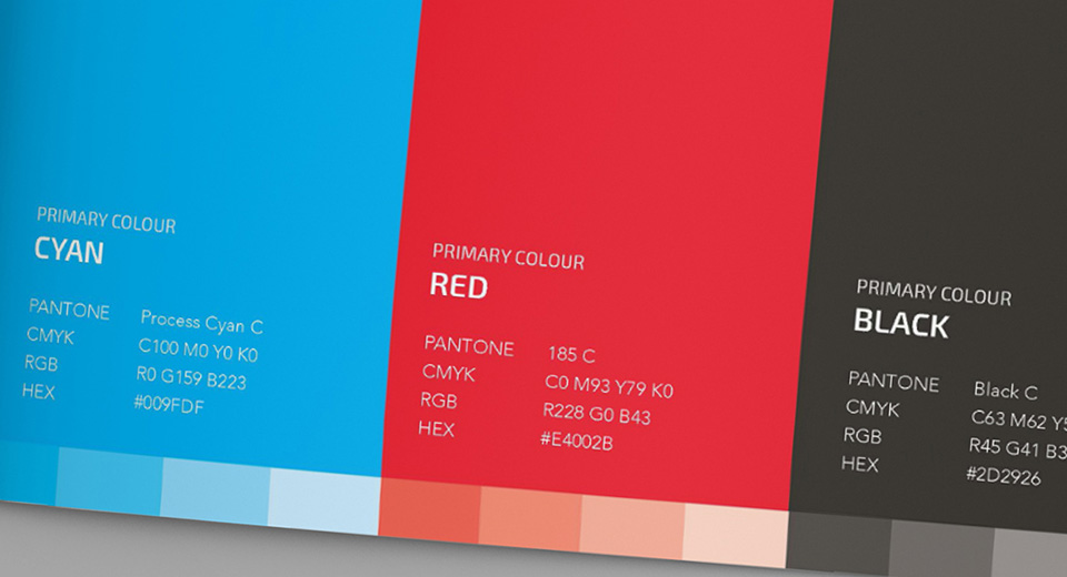
The colours blue and black are in line with the Maritime Singapore and Block 71 colours while the red represents our nation, Singapore.The program was launched with a series of collaterals that was in line with our brand concept and brand guide.

OUTCOME
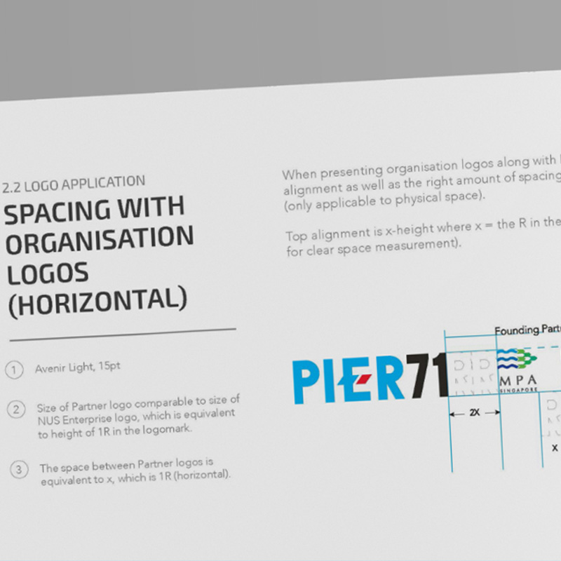
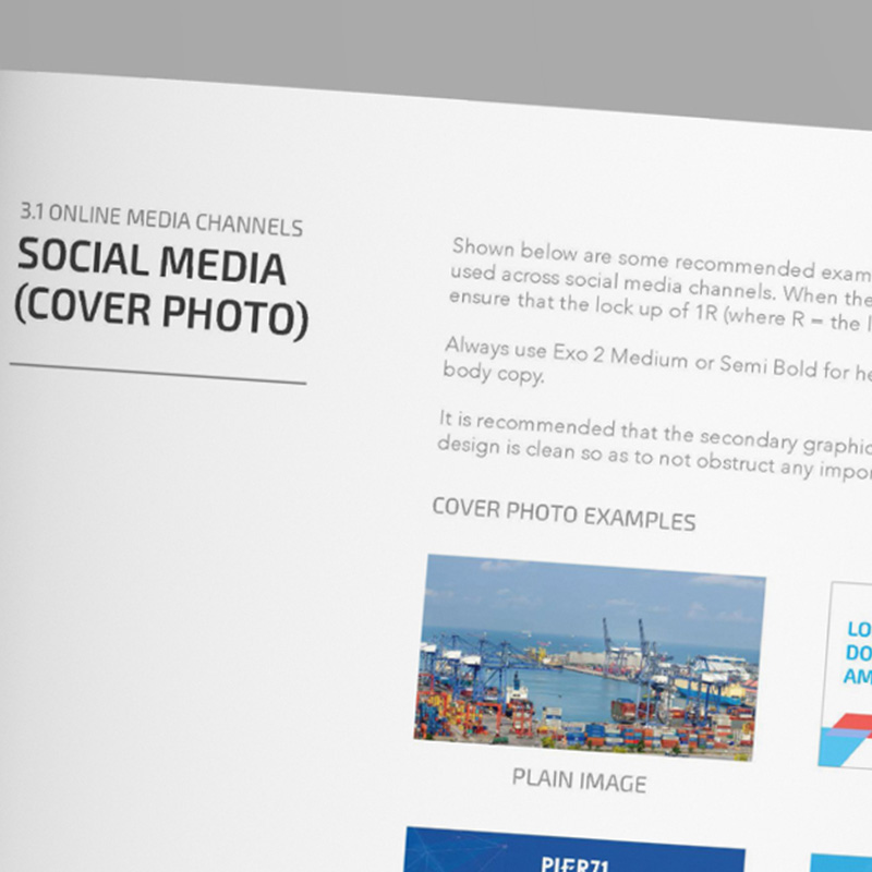
We set the guidelines clearly for both PIER71’s online and offline media channels, where we showcase possible EDM templates, social media images mockups, newsletter template layouts, poster templates and a powerpoint template. All these were created so as for PIER 71 to ensure brand consistency across all its touchpoints.


