THREE EMBERS
THREE EMBERS
THE SOURCE OF CULINARY PASSION
BACKGROUND
Founded by 3 veterans in the industry who were looking to elevate the catering experience and challenge the norms.
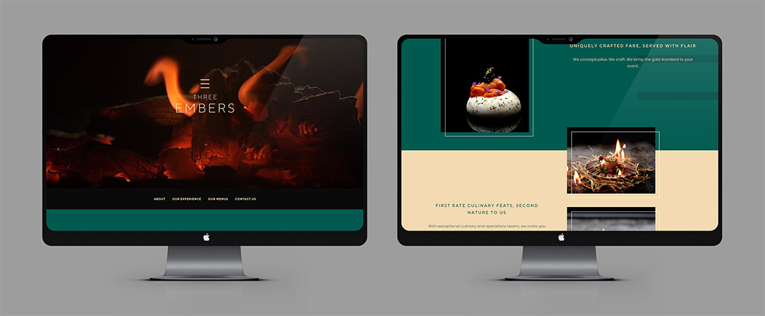
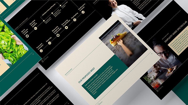
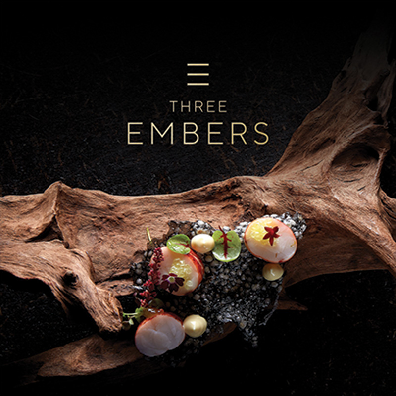
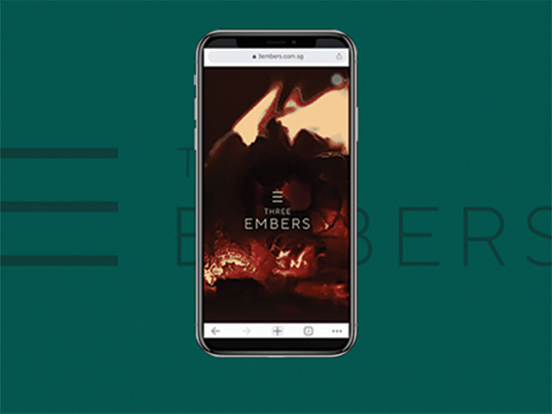
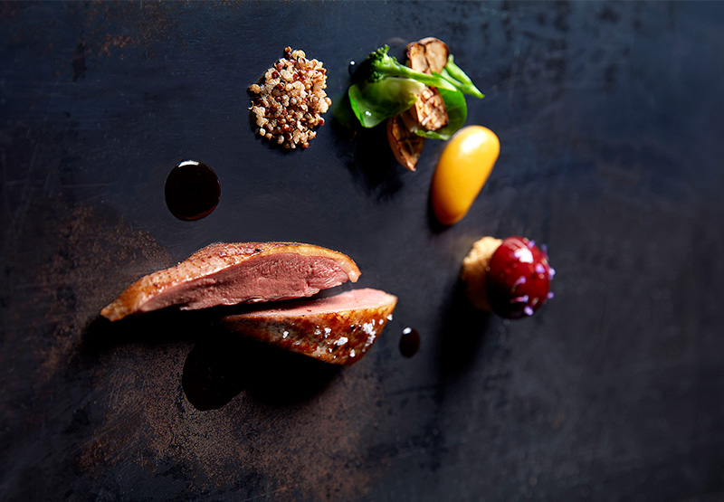
The 3 embers experience is all about the craftsmanship, sophistication, perfection and professionalism. With that, we brought those traits to life across the corporate collaterals, photography, videos and private dining area.
Ember represents the source of igniting fire. The name was built on how the company is the source of culinary innovation and delivers impeccable dining experience to clients and customers.
STRATEGY
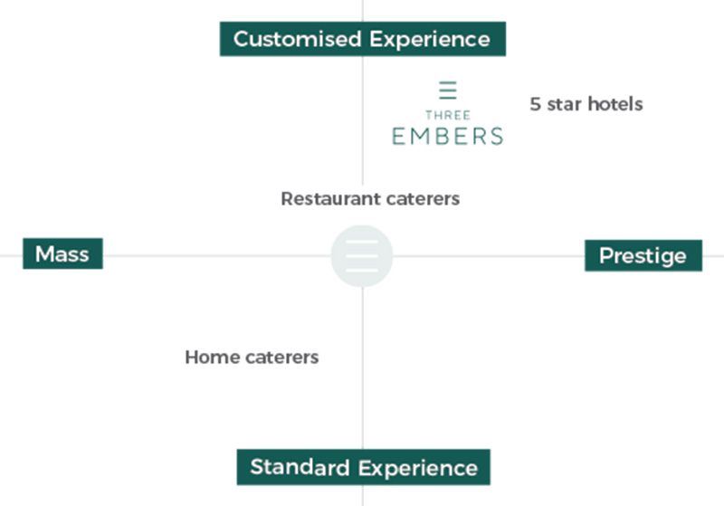
Competition was stiff with a few key premium players already present in the industry but the founding team was the core differentiator of the business. Thus, we utilised this unique trait to form the DNA of the brand.
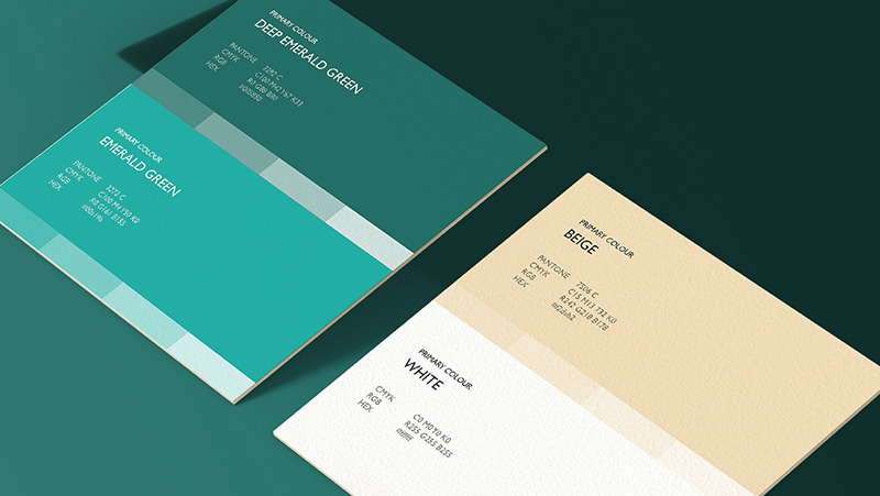
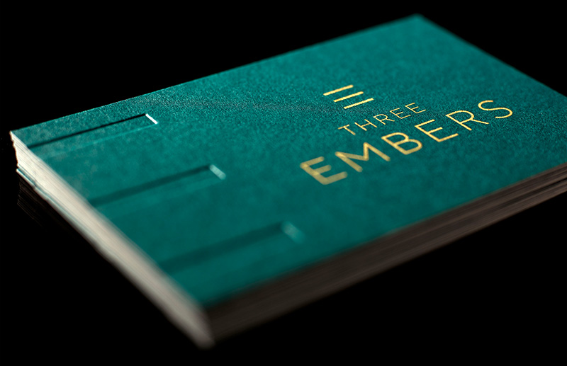
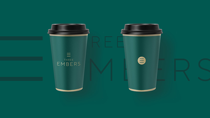
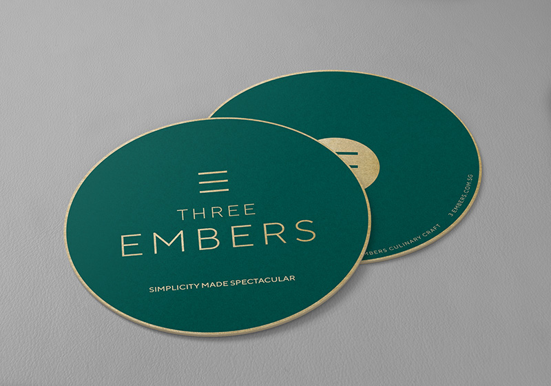
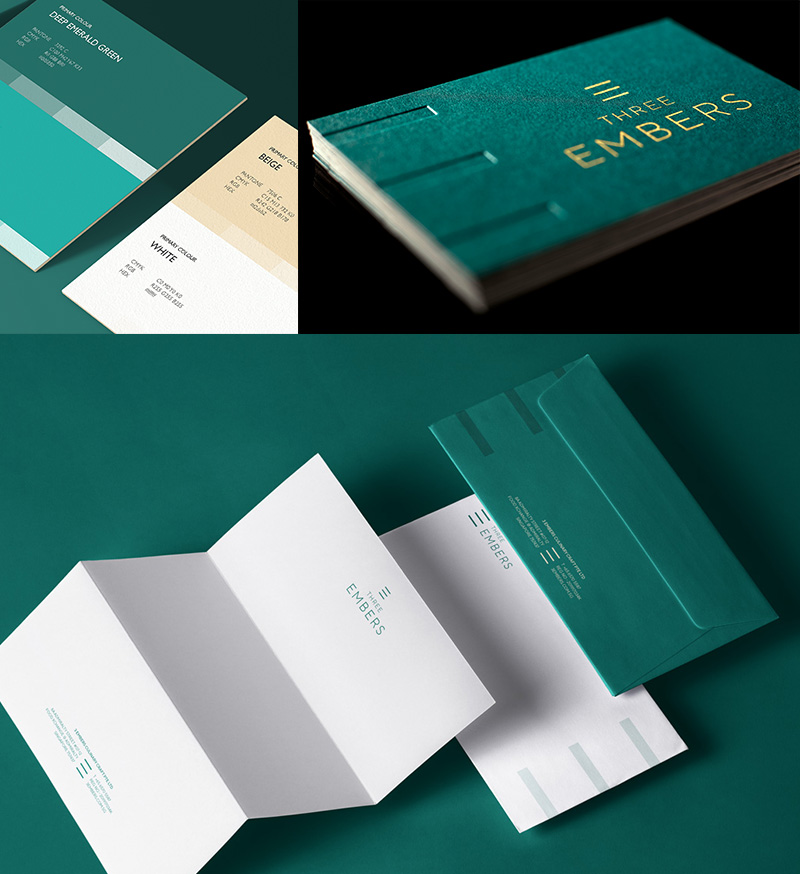
The colours used was kept minimalistic and exquisite. Emerald Green represented the inspiration and uplifting spirit of the founders while beige portrays understated elegance.
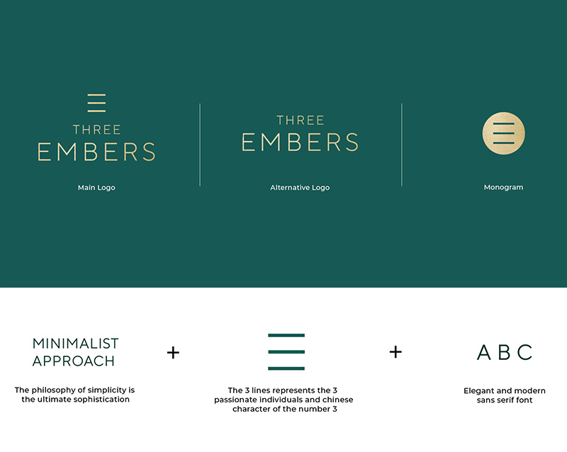
The monogram was created as an extended brand element, representing the 3 embers seal of assurance. Integrating the chinese number 3 from the name.
POSITIONING
Competition was stiff with a few key premium players already present in the industry but the founding team was the core differentiator of the business. Thus, we utilised this unique trait to form the DNA of the brand.
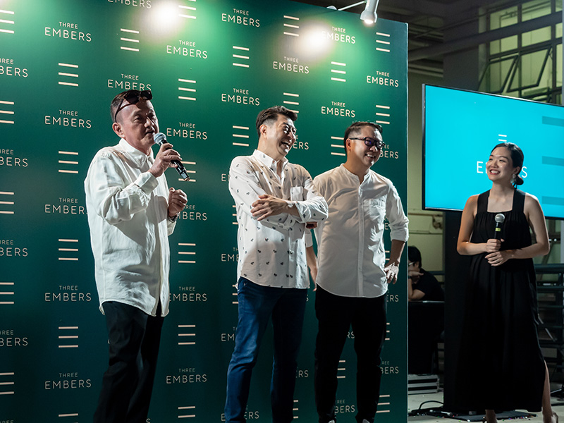
The brand was well received during it launch with industry players and clients resonating well with the brand. Despite being a new player to the industry, 3 Embers clenched a few big deals for the next year.
NAME/BRAND CONCEPT
3 EMBERS
THE SOURCE OF
CULINARY PASSION
