NUCEUTICALS
BACKGROUND
Founded by an aesthetic doctor, whom over the years in her practice, saw the growing demand and potential for nutraceuticals. She chanced upon new ingredients & technologies that helps users achieve improvements to their skin, face, body & nails.
With the intent to diversify her current aesthetic clinic offerings, she looks to create a new brand of nutraceuticals supplements that is well researched, scientifically advanced, and highly efficacious.
STRATEGY
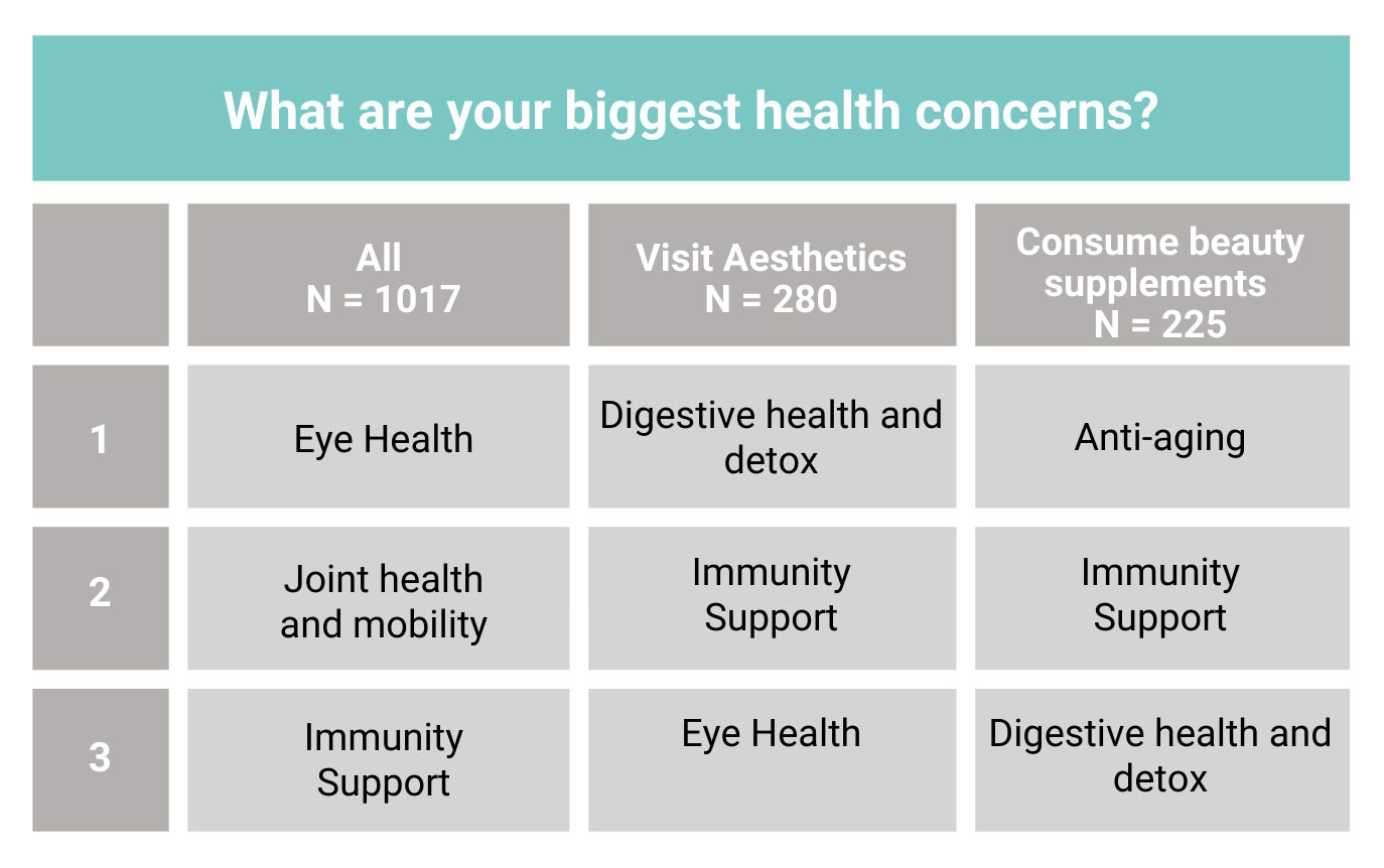
To understand key health problems and motivations towards health supplements consumption, we conducted a general public survey with 1000 respondents. This helped identify the opportunities in the market, map out product extension plans and evaluate the brand architecture that aligns with business growth.
Secondary research was also conducted to evaluate market trends and gaps that helped identify the brand’s key proposition and difference. This helped streamline the management strategic planning to align the short, mid and long term business goals.

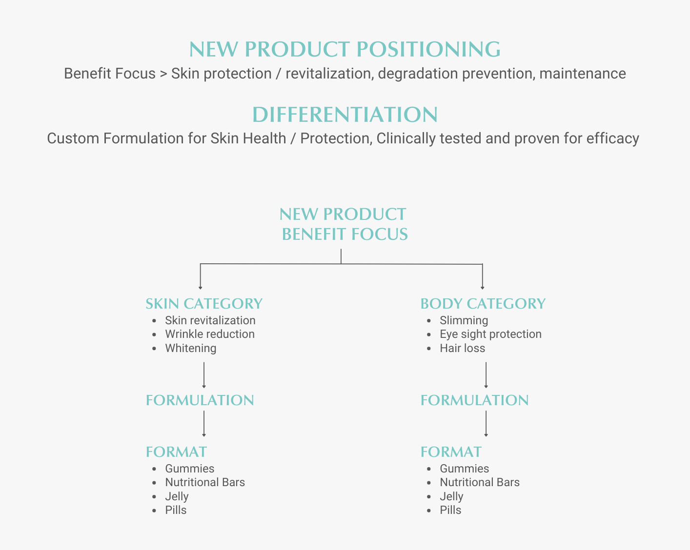
With the business goals and key proposition in mind, the brand was crafted to focus on the advanced power of science, technology and innovation. Helping consumers enhance their overall well-being for a better quality of life. Keeping in mind the product being proven, safe & effective, we came up with the brand name (Nuceuticals), product name (Skinergy Collagen Shot) & formulation name (Nutrinox).
IDENTITY
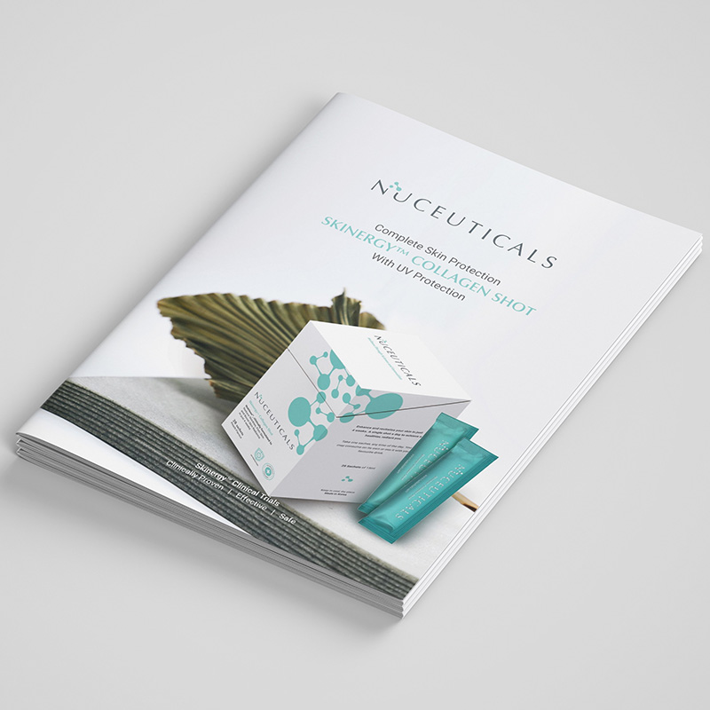
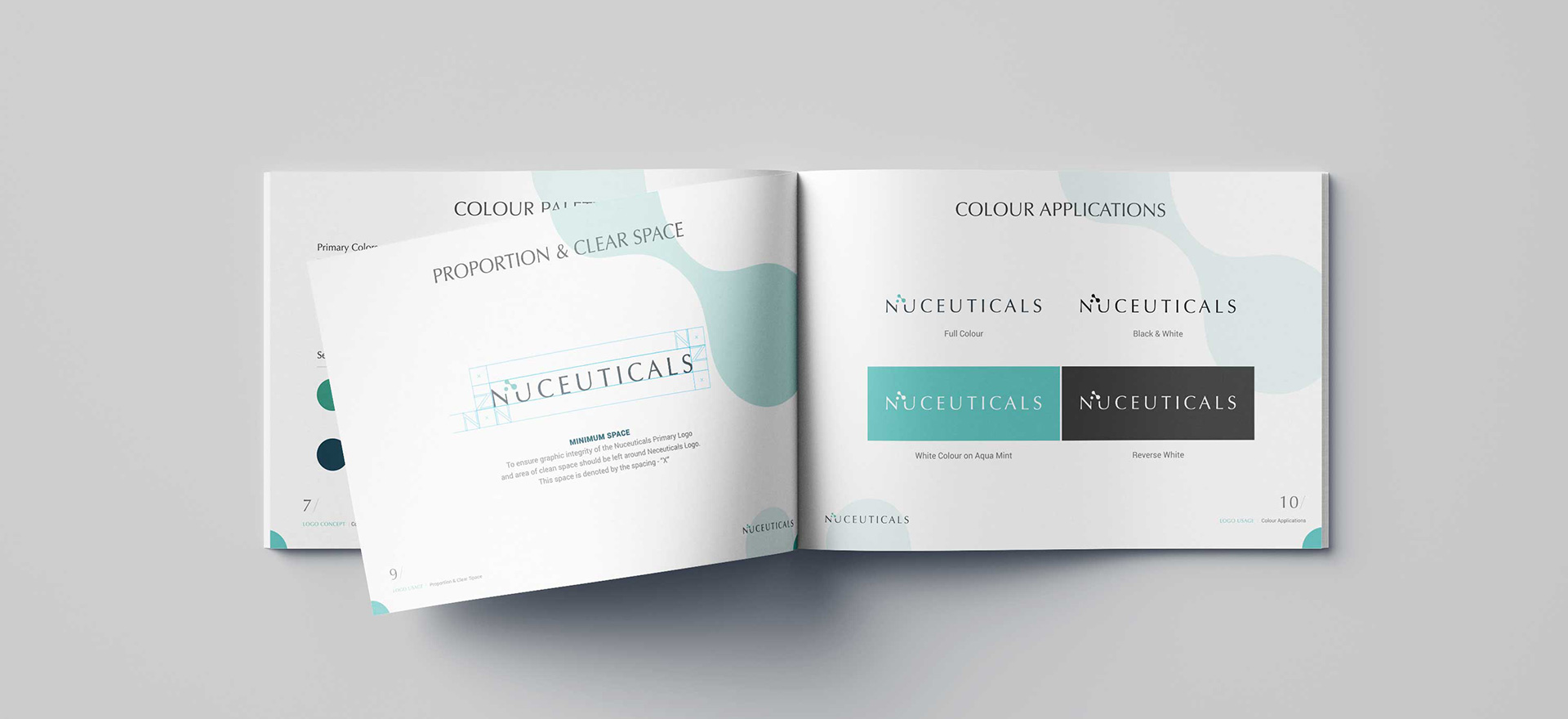
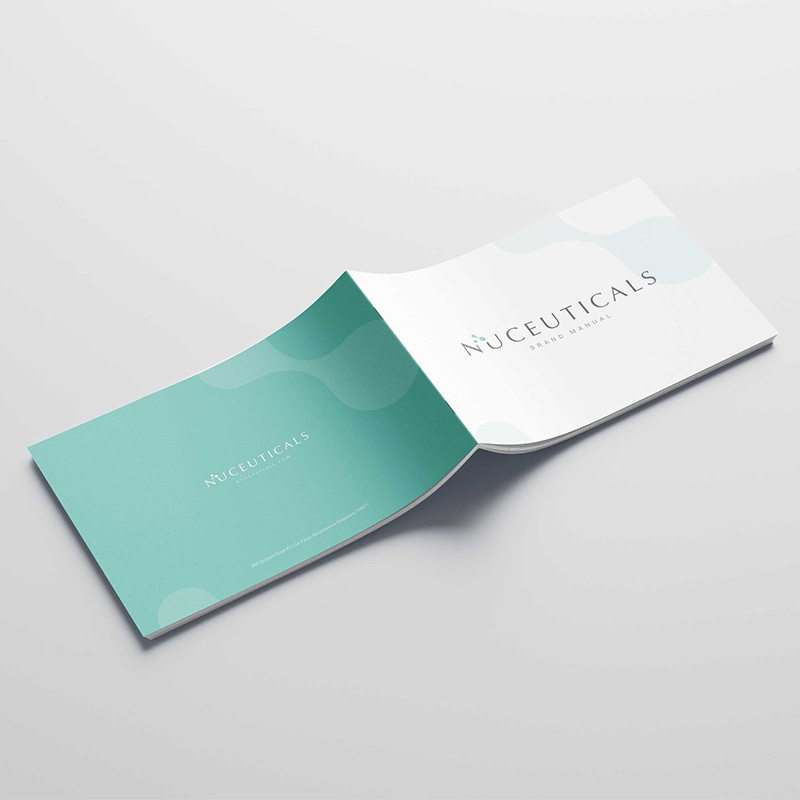
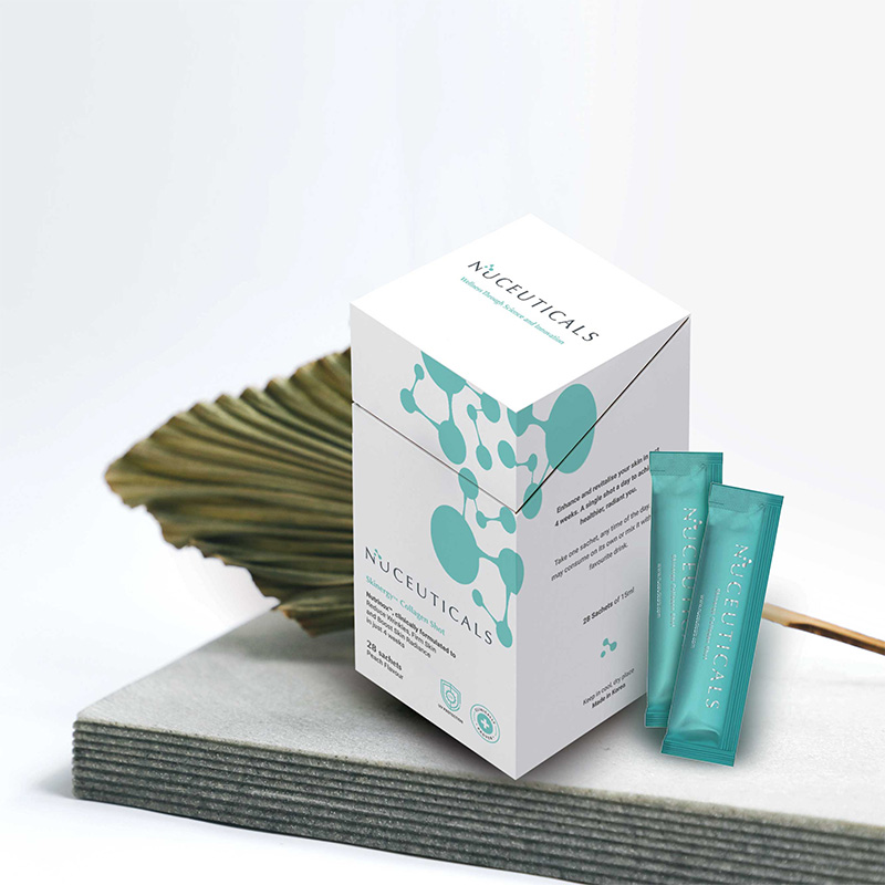
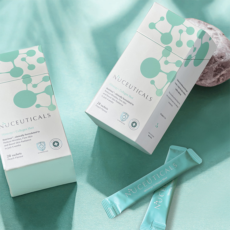
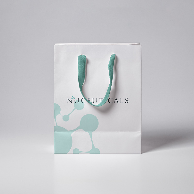
The new design focused on bringing out the brand DNA of clinically proven, trusted & powered by science and technology. Inspired by the cells icon & the name in a san serif font that evokes trust & approachability, the concept shows how Nuceuticals improves one’s well-being through enhancing & revitalising the building blocks in our body-cells.
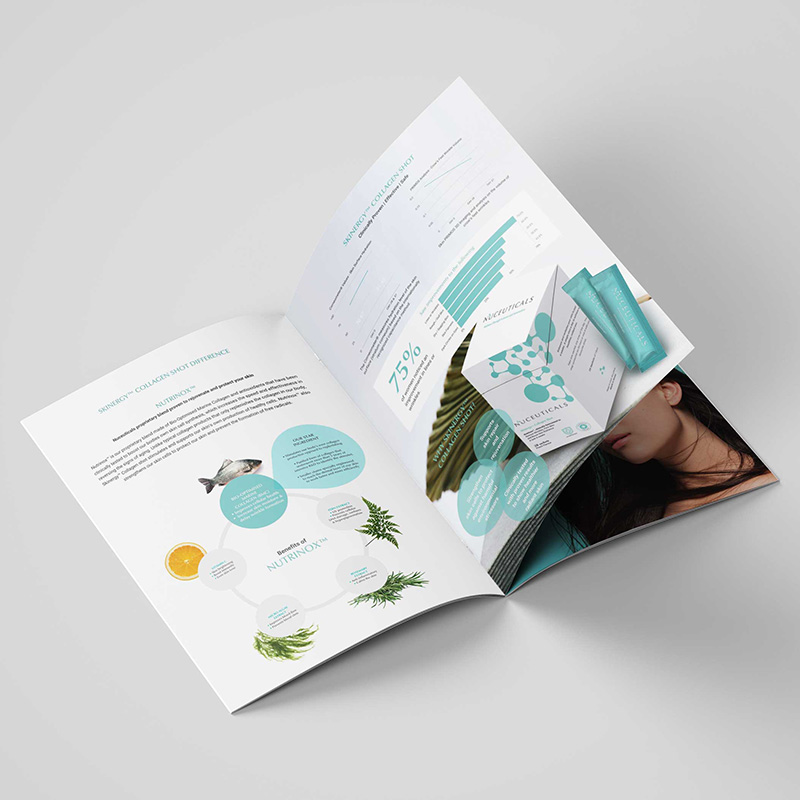
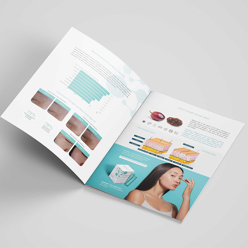
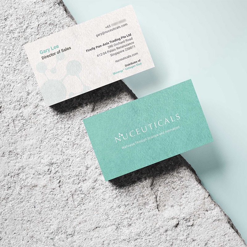
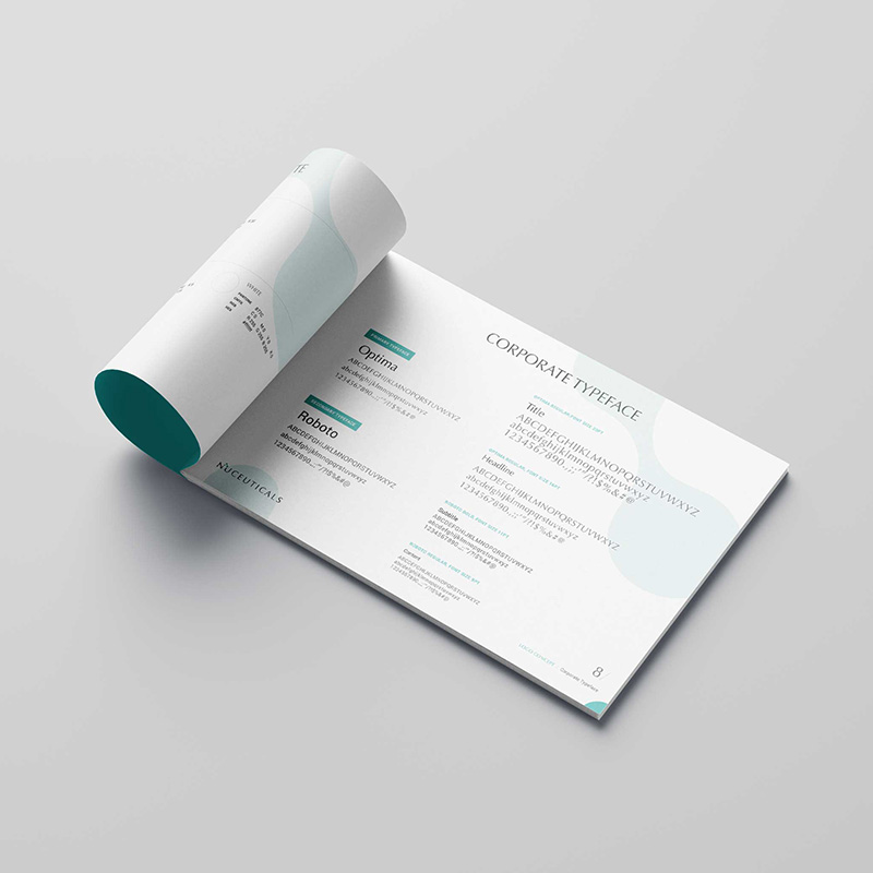
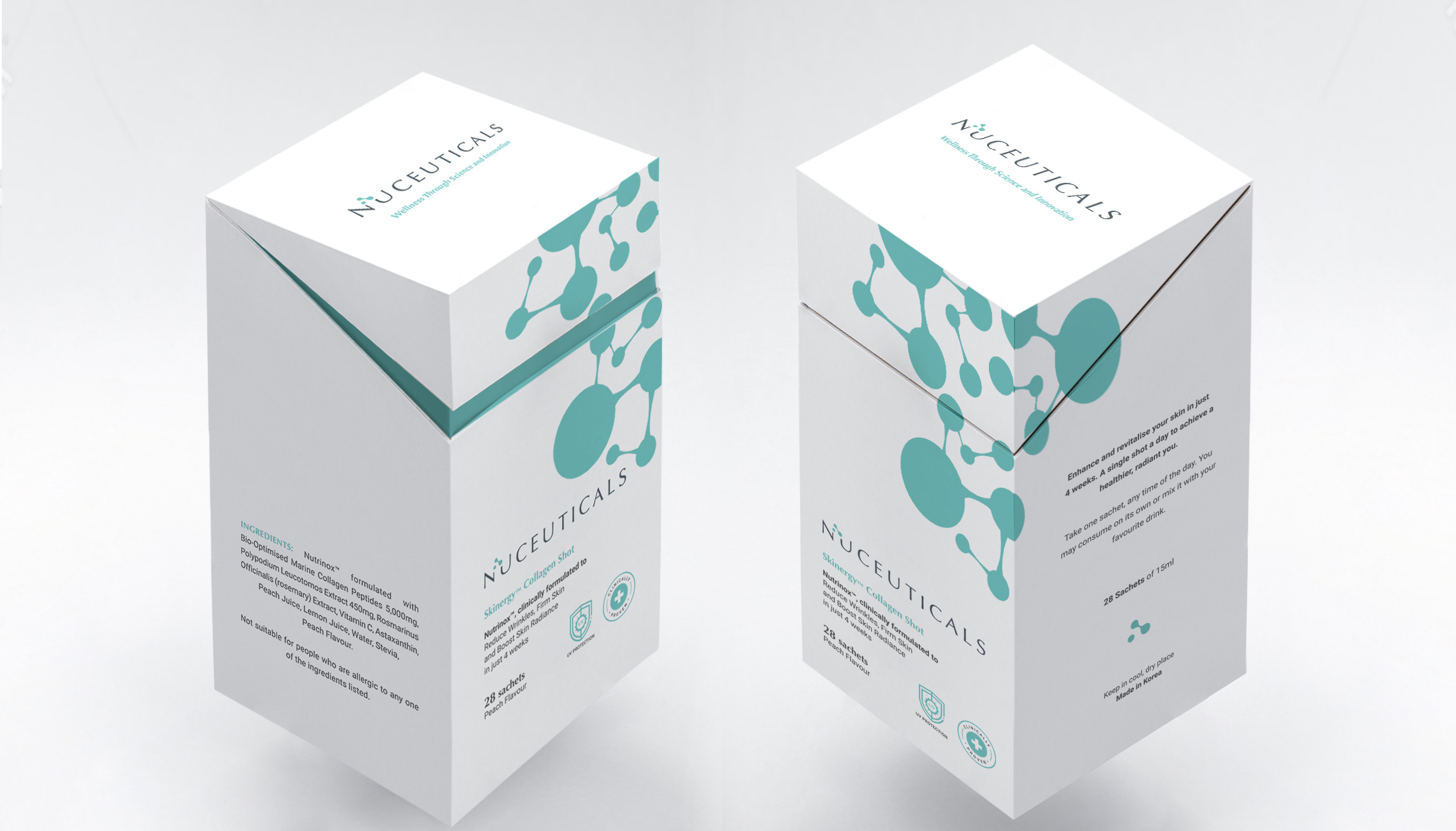
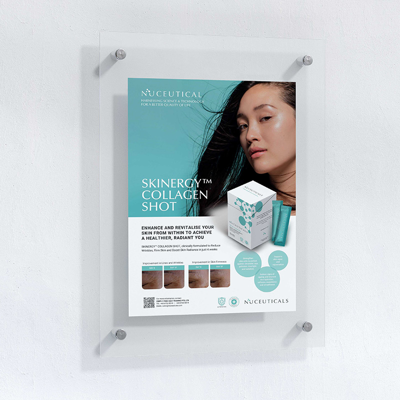
The corporate identity from its stationary, brochure, flyer to its packaging box followed the clean, minimalistic yet clinical look & feel. The mint colour used emphasises the element of revitalising & renewal.
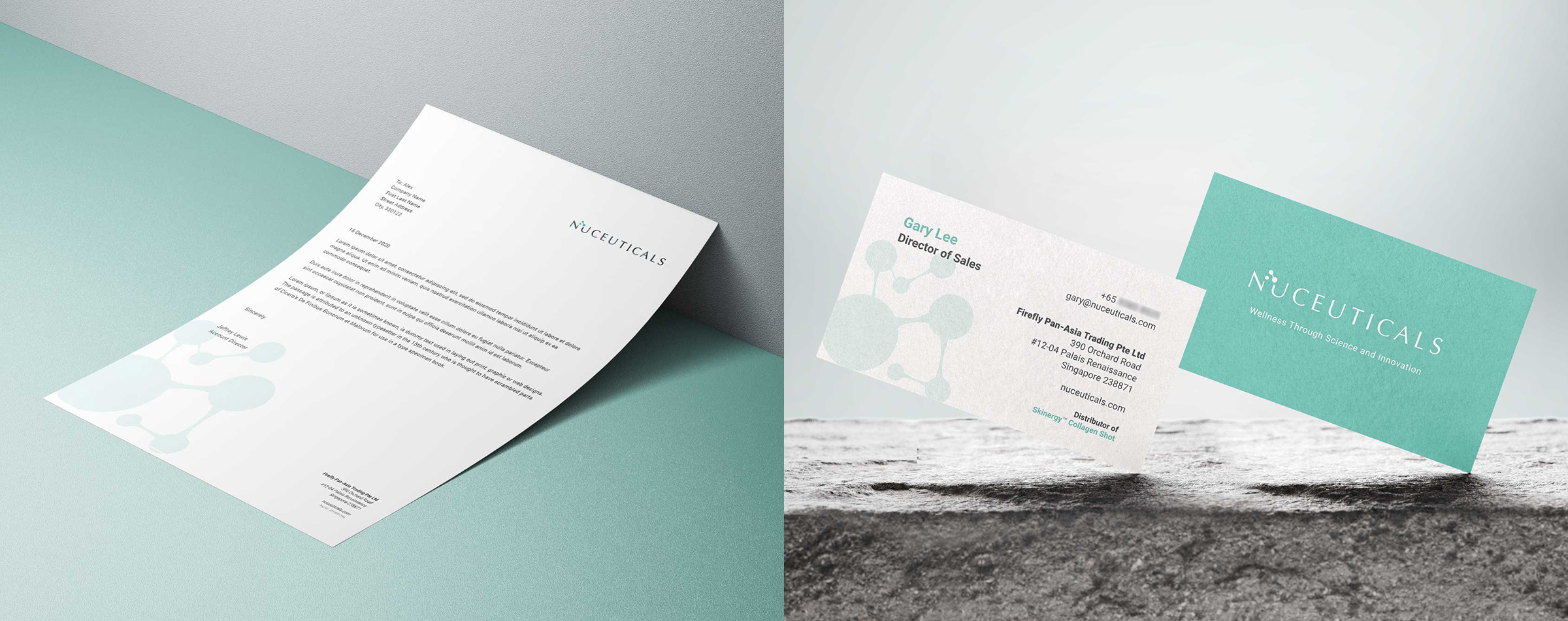
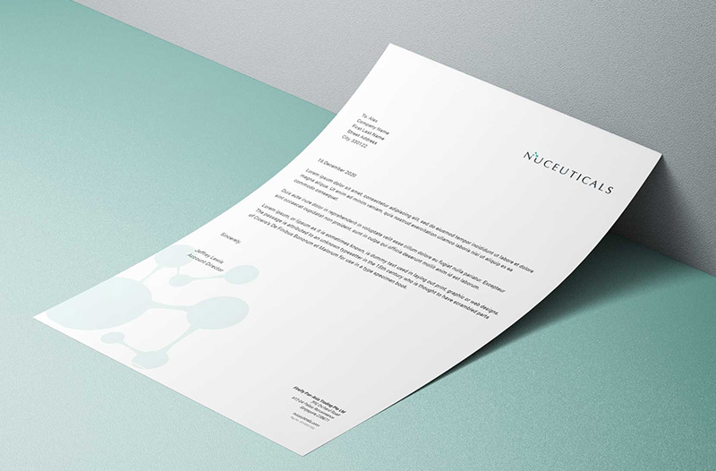
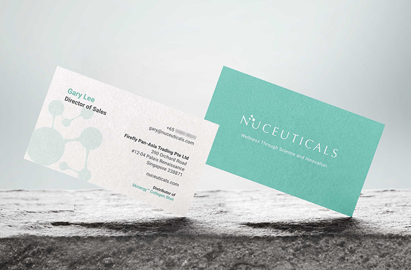
The copy for the collaterals too was kept professional and credible. The scientific content was communicated concisely. We came up with the brand story, tagline, marketing messages as well as product brochure content.
OUTCOME
From the name, identity to the final packaging of the product kept to the true essence of the brand- Harnessing Science & Technology for a better quality of life.


